The dashboard
Reading the dashboard figures
What the ten tiles show, what the auto and manual badges mean, and how to read progress against target.
Where to find it
Sidebar Dashboard
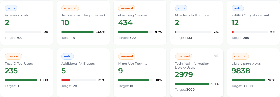
The Dashboard opens on ten tiles, one per reported metric, all scoped to the active period named in the top bar. Each tile shows the current value, a progress bar, the percentage of target reached, and "Target:" with the number.
Every tile carries one of two badges, and the difference matters:
- auto
- The platform counts this itself from visit records — Extension visits, Mini Tech Skill courses, EPPRD obligations met, Additional AMS users. You never type the value; you only set the target.
- manual
- Nobody in the platform generates this, so somebody has to enter it — Technical articles published, eLearning courses completed, Pest ID Tool Users, Minor Use Permits, Technical Information Library Users, Technical Information Library page views.
Below the tiles are three more panels: the Extension Activity Log, a Survey Overview with the submission rate, and a Visit Calendar for the current month.
What you'll see
One screen tells you where the program stands against every metric for the period you are reporting on, with any shortfall visible as an unfilled progress bar.
Good to know
An auto tile showing zero means no qualifying visit records exist in the active period — check you are looking at the period you meant. A manual tile showing zero usually means nobody has entered the figure yet.